Map of the Day: Median Housing Values

Virginia median owner-occupied house values by census district. Source: StatChat blog. Click to enlarge.

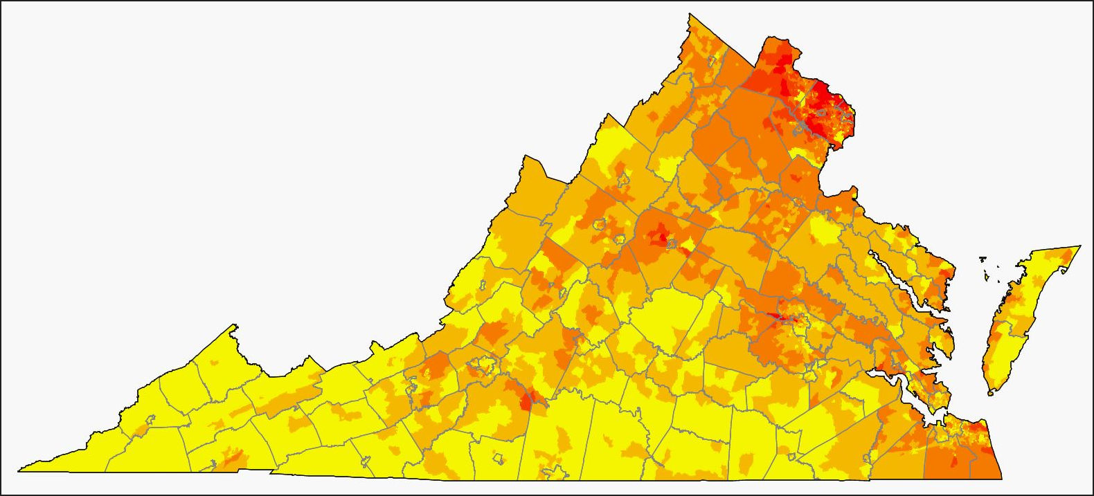
The StatChat blog has published a fascinating map showing the median value of owner-occupied housing across Virginia by census tract. The map appears as part of an essay on the relationship between housing affordability and school quality, which I may blog about later. But in the meantime, I thought the map was worth publishing on its own terms.

There are no huge surprises here — the highest median values occur in Virginia’s major metropolitan areas, most notably Northern Virginia, and values are lowest in depressed rural areas, particularly Southside and Southwest Virginia. (The blog post does not contain a color key indicating what values the colors represent, but you still get an idea of relative values.)

Still, there are some small surprises. There are patches of high values in Albemarle County just west of Charlottesville and to the south in (what I assume to be) Smith Mountain Lake. Values are relatively elevated in the Interstate 81 corridor from Roanoke to Winchester.

Picking up on themes previously explored on Bacon’s Rebellion, the rural/metropolitan schism in property values illustrates how difficult it is for homeowners in yellow areas (the lowest median values) to pick up and move to red areas (highest-value) in response to better job opportunities. The map also demonstrates the gulf in the tax base of local governments, which depend upon property taxes more than any other revenue source.

— JAB


Share this article


ADVERTISEMENT

(comments below)


ADVERTISEMENT

(comments below)


Comments

10 responses to “Map of the Day: Median Housing Values”

  1. Hamilton Lombard Avatar
    Hamilton Lombard

    The higher home values in the Urban Crescent is one of the main reasons why migration tends to flow away from it to the rest of Virginia. Rather than the reverse as Jim pointed out.

    I think the difference between local governments’ tax bases is better seen in the composite index, they have a county map here:http://www.doe.virginia.gov/school_finance/budget/compositeindex_local_abilitypay/ or the DHCD’s fiscal stress report, which also has some nice maps:https://www.dhcd.virginia.gov/sites/default/files/Docx/clg/fiscal-stress/2017-fiscal-stress-updated.pdf

  2. Spencer Shanholtz Avatar
    Spencer Shanholtz

    There is a color key if you click the tab in the upper left corner of the map. In addition, the map is interactive. If you click on any block group it will display the specific median home value.

  3. Reed Fawell 3rd Avatar
    Reed Fawell 3rd

    Hamilton –

    What does coloration differences on Virginia’s Eastern Shore and in Shenandoah Valley, past versus present, suggest to you, if anything?

  4. Hamilton Lombard Avatar
    Hamilton Lombard

    In the tract level map in Jim’s post the Eastern Shore’s home prices look a lot lower than than the Shenandoah Valley and you might expect it to have a much smaller tax base. The problem is that while the interior of the Eastern Shore is quite cheap, closer to saltwater home prices are much higher. If you look at VDOE or DHCD’s county level indexes Accomack and Northampton’s tax bases are quite similar to those in the Shenandoah Valley.

    1. Reed Fawell 3rd Avatar
      Reed Fawell 3rd

      Thanks for your reply. I agree that today “The problem is that while the interior of the Eastern Shore is quite cheap, closer to saltwater home prices are much higher.”

      On the other hand, the new wealth pushing up prices in waterside areas also presents an opportunity to leverage off of that new moving in wealth (in some cases extreme wealth) to benefit the interior. How best to do it while protecting and benefiting all interests is key question. I suspect it is a pressing and timely question, given the newly shifting demographics that likely will continue and increase demand everywhere.

  5. LarrytheG Avatar

    well the working theory here in BR is that it’s government rules that cause housing shortages , price increases, affordability… no?

    Would a map like this be able to illustrate which governments do a better job with rules so prices are less because they have less tight rules?

    1. The working theory is that housing shortages and rising costs are caused by the increase in demand rising faster than the increase in supply. Government rules restrict the ability of the home-building sector to increase supply.

      Under this theory, housing prices are most likely to surge in metropolitan areas where (a) demand is increasing and (b) local government policies restrict supply.

  6. djrippert Avatar

    “Picking up on themes previously explored on Bacon’s Rebellion, the rural/metropolitan schism in property values illustrates how difficult it is for homeowners in yellow areas (the lowest median values) to pick up and move to red areas (highest-value) in response to better job opportunities.”

    Ha ha … you should post a property value chart of El Salvador or Honduras. Somehow people living in those places pick up and move to Virginia’s metropolitan areas all the time.

    1. They also live 15 to a house.

      1. djrippert Avatar

        No they don’t. Much stricter enforcement of housing laws over the past 10 years have cut way back on that.

        https://www.washingtonpost.com/local/virginia-news/2014/03/29/88e6dc96-b5e1-11e3-8cb6-284052554d74_story.html

        Usually somebody will move here and stay with relatives who have been here for some time. As they get more established they will get their own place or room with a couple of other recent immigrants.

Leave a Reply