
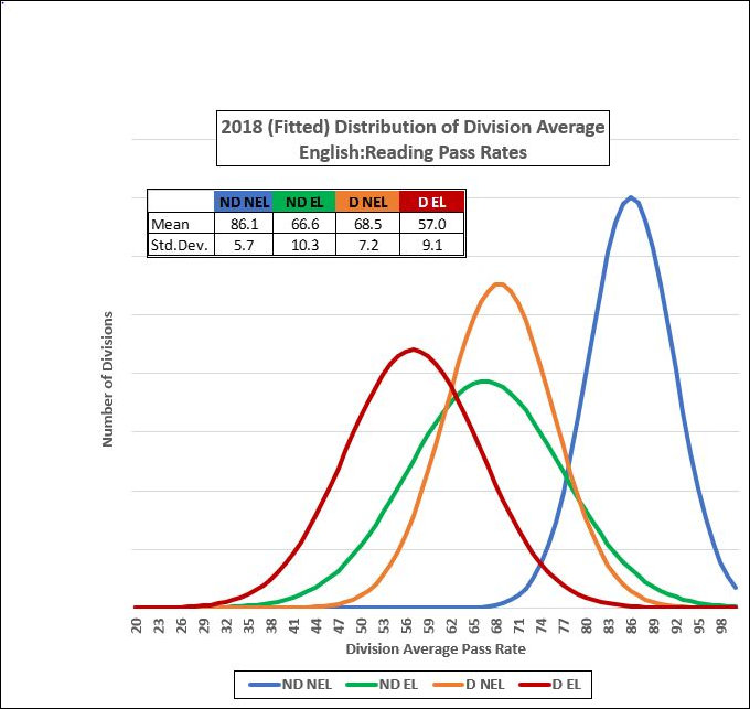
In our ongoing effort to make Bacon’s Rebellion the wonkiest, pointy-headiest media outlet ever dedicated to Virginia public policy, I present the graph above created by the John Butcher, the mastermind of Cranky’s Blog and frequent Bacon’s Rebellion collaborator.
Inspired by our previous posts about the performance of English Learners (sometimes referred to ESL, or English as a Second Language, students) on Virginia’s Standards of Learning tests, John ginned up this graph. He breaks down Virginia students into four categories (with “disadvantaged” being defined as students eligible for free/reduced cost meals programs):
- ND NEL (blue) — non-disadvantaged, non-English Learners
- ND EL (green) — non-disadvantaged, English Learners
- D NEL (orange) — disadvantaged, non-English Learners
- D EL (red) — disadvantaged, English Learners
The graph plots the number of Virginia school divisions against the percentage of students within each category that passed the English reading SOLs.
None of this will come as a surprise to anyone, but native English speakers tend to have higher SOL pass rates than English Learners, and non-economically disadvantaged students have higher pass rates than disadvantaged students. Those who suffer the drawbacks of being both disadvantaged and being an English Learner have the lowest pass rates, while those who suffer neither drawback have the highest rates.
While that may seem too obvious for words, here’s what’s not: There is considerable variability within each category. Indeed, there is so much variability that there are a handful of school districts where disadvantaged English Learners pass the SOLs at higher rates than non-disadvantaged, non-English Learners at a handful of other school districts.
Translation into everyday language: Coming from a poor household and learning to speak, read, and write English is not an academic death sentence. Some schools and school districts clearly out-perform others in helping these students succeed. Wouldn’t it be interesting if someone identified these schools and districts and inquired what they are doing differently?
(An aside: In the material he sent me, John notes, “These are Gaussian curves calculated from the means and standard deviations of the data. The actual distributions are skewed, not Gaussian. These curves merely serve to provide a quick visual indication of the average and spread of each of each set of data.” If you want to argue with his presentation, take it up with him — not me. I’ve still got a lot to learn.)
Leave a Reply
You must be logged in to post a comment.