Cranky Shows the Educrats How It’s Done

Cranky, er, I mean John Butcher, continues to do the kind of statistical analysis of Virginia’s public schools that I wish we would see from our public officials. In a recent post on Cranky’s Blog, he dove deeper than ever into the relationship between economic disadvantage and SOL outcomes. And he demonstrated with greater clarity that some schools do better at educating disadvantaged students than others.

It is universally acknowledged that students classified as “disadvantaged” — qualifying for free school lunches — perform worse on average in Standards of Learning tests than do students not so categorized. Likewise, it is universally acknowledged that schools with higher percentages of disadvantaged students will tend to show lower SOL test scores than schools with fewer disadvantaged students, and that any evaluation of their effectiveness should take that fact into account. While the percentage of “disadvantaged” students accounts for roughly half the variability between schools, other factors — some of which schools and school districts can manage — also account for half.

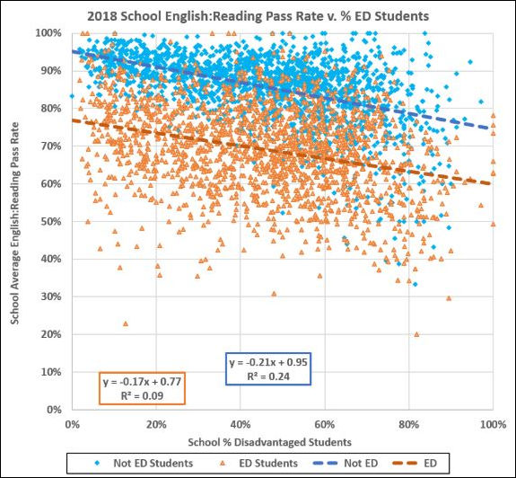
In a graph published on Bacon’s Rebellion last week, John showed the variability between school districts. In the graph shown above, taken from his most recent post, he showed the correlation between English SOL pass rates and the percentage of disadvantaged for all schools. Then he did something particularly interesting — he overlaid schools from a specific district over the universal graph to show how that district compares to state averages.

The graph above compares average SOL scores for both advantaged and disadvantaged students statewide. It shows that the higher the percentage of disadvantaged students in a school, the worse both categories of students perform. In schools dominated by disadvantaged students, even the non-disadvantaged students do worse. Statewide, the depressive effect is roughly the same, as can be seen by the slope of the two lines.

Now, let’s look at some individual school districts.

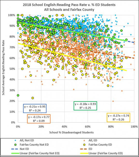
In Fairfax County, Virginia’s largest school district, we can see that the effect of higher percentages of disadvantaged students upon non-disadvantaged students (the green line) is in line with statewide averages, but the impact on disadvantaged students (the yellow line) is particularly striking. What is going on? Do Fairfax School Board members have a clue that this is happening?

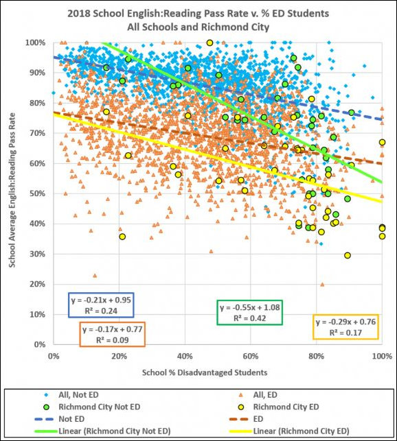
Now, looking at Richmond City Schools, we can see that the effect of larger concentrations of disadvantaged students has even more pronounced effects than in Fairfax County. The performance of disadvantaged students (the yellow line) drops off even more sharply than the state average. The performance of non-disadvantaged students (green line) drops off calamitously. No wonder parents from non-poor families yank their children out of Richmond Public Schools!

(John shows similarly sharply sloping lines for schools in the cities of Hampton and Newport News.)

This analysis leads to interesting lines of inquiry — lines of inquiry, it is safe to say, that few in the public school systems (and no one in the media) is asking. Why does academic achievement drop off so sharply for schools with especially high percentages of disadvantaged students? Clearly, the concentration of poor students has a deleterious effect. What is that effect? Different people will proffer different theories, depending upon their ideological persuasion. Readers should join me in urging John to probe even deeper.


Share this article


ADVERTISEMENT

(comments below)


ADVERTISEMENT

(comments below)


Comments

14 responses to “Cranky Shows the Educrats How It’s Done”

  1. Steve Haner Avatar
    Steve Haner

    I’d love to see a third variable, hard to track probably, and that is the percentage of children in each community who are either home schooled or in a private setting. I suspect but cannot say for sure that in Richmond City it is higher than many other urban systems. This certainly does reinforce the attitudes of parents avoiding the public system when they can. But if private schooling is more common in Richmond, that might also contribute to these results.

    1. LarrytheG Avatar

      I agree with Steve, it WOULD be interesting and informative to see if this effect is also present in non-public schoools as well as other school districts in Va.

      I have a hard time believing that this effect is the same across all public schools. For instance Title 1 instruction is present in many schools on a per student basis and some schools – the entire school is a Title 1 school and one would expect the extra resources of Title 1 (which provides Masters degree level remedial instructors) would make a difference.

  2. LarrytheG Avatar

    It’s pretty interesting, I’ll agree and there are a couple of school districts in Va that have particularly good SOLs – Highland County and Poquoson if I recall so I’d wonder how those systems would look.

    I give Cranky credit but also point out that it’s VDOE that is providing all this data – voluntarily so that folks like Cranky can “mine” it.

    I support what Cranky is doing with some minor caveats about the potential to read the data wrongly.. and seeing the disadvantaged kids get even worse scores as the percent of the disadvantaged increase across the entire school district doesn’t seem right. This is where I’d want to see that graph for each school in the school district – like Fairfax or Henrico, Chesterfield.

    1. I’d love to see the data for every school district in the state, too.

      Perhaps we could start a GoFundMe campaign to raise money to support Cranky in such an endeavor. Cranky, is there any sum that could induce you to devote a solid week or so of your time to the cause?

  3. “I give Cranky credit but also point out that it’s VDOE that is providing all this data – voluntarily so that folks like Cranky can “mine” it.”

    Larry, I thought you were opposed to transparency in government operations. Or was that just in public higher education?

    1. Yr. Excellency!

      Or is it now “Yr. Times-Dispatch Editorialist Excellency”?

      The graphs for FFax, Henrico, & Chesterfield (as well as Hanover and Richmond’s peer cities) are at calaf.org.

      The spreadsheet that produced the graphs you posted (as well as the others I posted) will do any division. There is a further tab in the spreadsheet that presents the division data as a list. It takes a wide screen monitor and a little care (or a lot of clicking about) but the data are available for anybody who wants them. But beware: The VDOE suppression rule bowdlerizes the data for any situation where there is a group of <10 students. For instance, in the case of Richmond, 7 of 43 schools get something suppressed.

      With that limitation, the data are here:
      https://www.dropbox.com/s/p1vbsf3a2a5zth0/2018%20school%20ed%20not%20all%20subj%20posted%20copy.xlsx?dl=1

      1. LarrytheG Avatar

        While the spreadsheets are appreciated. – it’s the charts that really bring it home.

        I’d like to know more about what VDOE is suppressing and whether it’s just Richmond or across the state and if they acknowledge it and provide a rationale for it. There are other schools in Virginia with problems like Richmond – Lynchburg might be one.

        My view to this point is that the graphs are a bit suspect and we need to see more charts for more districts and for some districts – the individual schools because the charts right now are from 10,000 feet and seem to indicate that no matter what that disadvantaged kids will not get better even with additional resources like Title 1. If that’s indeed true – that’s a bombshell and deserves to be known, but I’m suspecting something is amiss here.. that we will see at some point if we do more data …

        Jim says your data proves some schools are better than others with disadvantaged kids… What schools are better? I do not see it.

    2. LarrytheG Avatar

      Izzo – where in the world did you get that idea? I’m totally in favor of transparency across the board!!

      In education – I’d actually like to see MORE – from the non-public schools so we can actually compare their performance to Public school performance.

      Not sure where you got the idea that I’m opposed – it’s the opposite.

    3. “Times-Dispatch Editorialist Excellency” — TDEE for short? That’s a tidy acronym.

  4. LarrytheG Avatar

    re: ” n education – I’d actually like to see MORE – from the non-public schools so we can actually compare their performance to Public school performance.”

    and I need to add this: If we do have data that does prove than non-public schools do a better job with disadvantaged kids – I’m all for funding them with taxes on a per-student basis.

    Clearly , and there is no question, the public schools are not totally successful with low-income kids. Some of it is due to the fact that these kids
    tend to be clumped in low-income neighborhoods and we do schools by neighborhoods.

    But if non-public schools can take kids from these neighborhoods and do better than public schools – let’s do it!

    What I’m opposed to is taking tax money for private schools that have no transparency of their own performance and would not be judged on a true apple-to-apple comparison basis.

    People who support using tax money for private schools without true transparency do not really have the interests of these kids at heart. They have a different agenda that actually seeks to undermine and harm public education itself as a political philosophy and really do not support transparency for private schools … at all.

    The one single thing that sets this country apart is the promise of opportunity for each child. Once that is destroyed – we as a country are in trouble but there are folks who want that. I do not.

    1. I completely agree, the private schools should play by the same transparency rules. In fact the better ones generally strive for transparency on key factors because they do well on those and that’s part of their marketing — although they will tell parents, one of their advantages is less time spent on testing and more on “teaching.”

  5. Reed Fawell 3rd Avatar
    Reed Fawell 3rd

    Have you even gone back to a museum of art again and again, captured by a painting hanging on a wall, or a series of paintings on a wall. You can’t escape some art, because it speaks to you. It is quite literally alive, shape shifting with the light, shape shifting in your head, rearranging itself, and rearranging you. What does it all mean? What does it say? What can I do about it, 0r with it? What can I say to describe it, atone, or apologize for it?

    These are the times you must be alone with the art on the wall, like a serious reader must be alone with a serious book. No one else can interfere, no one. Time has stopped. Judgement too. You are at sea, alone, lost somewhere in it. Your experiences, visions, judgements are unique. As is the art that the artist has left behind. Only you can sort it out, in your own unique way, during those times of initial confrontation and engagement.

    Jim’s title above John Butchers’ work speaks to this:

    Cranky Shows the Educrats How It’s Done

    There are many many ways to see and interpret John’s work. Each of us have our ways. Hopefully, among those ways are Educrats taking it seriously. That needs to include taking it, and what they see in it personally. That is very hard work. But it must be done. Every child, every single one, has a right to an equal chance to get the best education that best serves him or her in this world. Obviously, today, right now, we are failing most all our children grievously.

    1. Reed Fawell 3rd Avatar
      Reed Fawell 3rd

      Cranky’s work here reveal important realities, and raise big questions. What do those realities mean? What is their context? What caused them? How are they to be solved? Here, with this comment, are the beginnings of a simplistic and summary effort in a series of follow on comments that will try to shed light on all of these questions, and suggest solutions. These serial comments will be a syntheses that is based on the lifetime work of many others.

      These realities exposed by Cranky are by design local. But they are also now spread far and wide, are national and international. They also impact ALL students, without regard to class, race, income, and/or ethnicity. And those impacts on performance levels, whether up or down, slight or catastrophic, vary in time and place across the demographics of all students, no matter their background. A national tragedy in primary and secondary education is going on in numerous modern western nations, harming all students. This is not an American problem alone. Other nations that ranked higher than we in education, have fallen farther down the international rankings than America.

      As to America, the SAT and ACT scores, verbal and math, of ALL American students declined drastically between roughly 1970 and 1983. Those scores relating to ALL students have yet to recover. They have been essentially flat since the early 1980s, with no general improvement shown in public education. Those declines that adversely affect all students are so far proving to be long term, impacting both advantaged and disadvantaged.

      However, across the board declines since 1970, have substantially widened the gap between advantaged and disadvantaged students. Most scholars suggest that this disproportionate impact, widening the gap, arises because Disadvantaged Students depend more on learning in school than Advantaged students. Advantaged students tend to have have more learning opportunities outside their schools, and few obstacles outside school to learning than disadvantage kids tend to encounter outside the school.

      This opinion seems supported by the fact that the Head Start program substantially closed the gap the between Disadvantaged and Advantaged students. This gap closure benefited only those Disadvantaged kids who participated in Head Start. But the gap between those students widened again during the Kindergarten and first grade, so there was no apparent advantage to Head Start Kids from and after the second grade. Meanwhile, Advantaged kids also lost ground across the board during these early years.

      This is called Fade Out where prior advantages of kids are lost in school. Something had to be going wrong with learning in most all American schools Whatever the problem was, it was hurting Disadvantage kids the most. There was an obvious disproportionate impact, no matter the school and its locale, but was also grievous harm being done in school to many kids, irrespective of whether they were advantaged or disadvantaged. The greatest tragedy burdened the Disadvantage child who lost gains earlier achieved. And was left without equal opportunity for the education he or deserved, but was now being denied to disadvantaged students.

      Even more surprising was the fact that these awful trends began occurring in Western Europe starting around 1990, and those societies have not yet recovered yet, save one that had the problem even before America.

      I’ll discuss Europe next.

  6. Accounting for the percent Asian students makes an enormous difference in the correlations. In all of my work, I have used Asian, Black, Hispanic, and White as the independent variables, rather than FRM. There is a strong correlation between percent FRM (free and reduced-price meals) and percent Hispanic, so either could be used in the correlation studies. There is also a strong correlation (0.99) between SOL performance and SAT performance, so either could be used as the dependent variable.

Leave a Reply