
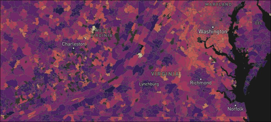
Click for larger image.
If you squint real hard, you can see the map above displays Virginia and parts of surrounding states. The color codes mark the average commute time by zip code. The dark purple indicates zips with the shortest average commutes and the pinkish-yellow colors the longer commutes. To view the specifics for any given zip code, check out the interactive map created by AutoAccessoriesGarage.com, an online auto accessories retailer.
The Washington metropolitan region appears to be the commuting hell-hole of the country. Only the New York and Los Angeles metros come close. Maryland ranks 1st among all states for the longest average commute (31.9 minutes), while Virginia ranks 4th (28.6 minutes). Even the most cursory glance at the map above shows that in Virginia the longest commutes are centered on the Washington metro and outlying jurisdictions.
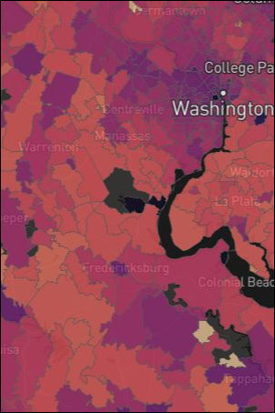 Interestingly, commute times in the center of Washington, D.C., are relatively short — some in the vicinity of 20 minutes. Commutes are tolerable in zips near the core in jurisdictions like Arlington, Alexandria and even in areas farther out such as Tysons, Reston and Herndon. But average travel times become brutish on the outlying fringes of the metropolitan region, sometimes exceeding 50 minutes.
Urban cores across the state have shorter commuting times. That applies to Norfolk, Richmond, Charlottesville, Roanoke, Lynchburg and Virginia’s smaller metros. Another pattern that strikes the eye is the line of purple along the Interstate 81 corridor from north of Harrisonburg through Staunton, Lexington, Roanoke, and Blacksburg all the way to Bristol.
There are patches of pinkish-yellow in rural Virginia where, presumably, inhabitants have to drive great distances to jobs — the West Virginia phenomenon.
The map vividly shows that the biggest transportation dysfunction in Virginia is the mass movement workers from the bedroom communities of far-flung Washington exurbs to jobs in the metro core. What the map doesn’t reveal is how to solve the problem, which is rooted in counter-productive zoning and land use policies. This map shows symptoms, not causes. Still, even a map of symptoms has its uses.